Colours of the year 2023
Every fall the major paint companies around the world releases their ‘Colour of the year’ for the following year. This year is just the same - around August (2022) we find most companies have released their colours for 2023. Let’s see where the experts think the colour trends are going for 2023.
Farrow & Ball Colour Trends 2023
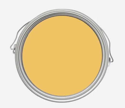
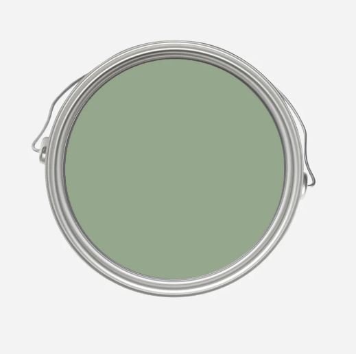
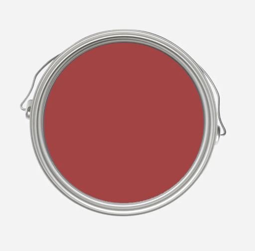
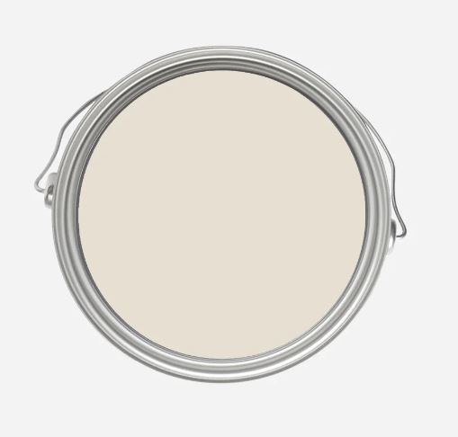
The luxury British brand Farrow & Ball doesn’t have a colour of the year as such, instead they choose to have a few colours to show the colour trends for the next year. This year Farrow and Ball has the following paint colours trending:
Babouche #223 a fun yellow, Breakfast Room Green No.81, Incarnadine #248 a great scarlet tone colour, Schoolhouse White No.291 - a great neutral, Stone Blue #86 shown here from left to right.
Sherwin-Williams Colour of the Year 2023 - Redend Point
The world’s biggest paint company, Sherwin Williams announce Redend Point (SW 9081) as their colour of the year. It is a warm, earthy neutral which will work in many rooms and will create a calm, cozy feeling.

Sherwin Williams Redend Point, Image: Sherwin Williams
Dulux Colour of the Year 2023 - Vining Ivy, DLX 148-6
Dulux / PPG another big paint influencer choose this vibrant blue-green-teal colour. This is my absolute favourite of the bunch. This colour can be used in so many settings to create serene, calming spaces or could also look vibrant when compared with contrasting colours.

Benjamin Moore Colour of the Year - Raspberry Blush 2008-30
This year Benjamin Moore has gone for a rich, saturated coral called Raspberry Blush 2008-30. It is a joyful and fun colour. I think it is a beautiful colour to use sparingly to create major impact.

Benjamin Moore Colour of the Year 2023, Raspberry Blush 2008-30. Image: Benjamin Moore
As always Benjamin Moore also releases their Colour trends with the Colour of the Year. This year the colour trends include Conch Shell 052, Cinnamon 2174-20, Wenge AF-180, Savannah Green 2150-30, New Age 1444, Starry Night Blue 2067-20 and North Sea Green 2067-20

Benjamin Moore’s Colour Trends for 2023. Image: Benjamin Moore
Behr Colour of the Year 2023 - Blank Canvas DC-003
Beauti-Tone has also chosen a very versatile neutral, it is aptly called Blank Canvas and it set to become one of Behr’s all time favourite and best selling paints.
Behr’s colour of the year for 2023 is Blank Canvas, Image: Behr.com
Valspar Colours of the Year 2023
For the first time Valspar has decided to choose a 12 colours as part of their colours for 2023 and not a single colour as we have seen in previous years. Apart from Everglade Deck, the entire collection for Valspar also leans towards the pastel colour as we have seen with BeatiTone. We also love all the names:
Ivory Brown, Cozy Whites, Gentle Violet, Blue Arrow, Flora, Desert Carnation, Green Trellis, Rising Tide, Holmes Cream, Southern Road, Villa Grey and Everglade Deck.

Valspar Colours for 2023, Image: Valspar.com
BeautiTone Colour of the Year 2023, Moments CL24-4
Home Hardware’s paint brand BeautiTone has an absolutely stunning colour for 2023 called Moments. They have also released a colour trend with all our favourites colours in the best possible pastel versions.

Moments CL24-4 - my absolute favourite of the 2023 colours

Pastel colour trends for 2023 from BeautiTone - Into the surf, Garden Mint, Chasing Tides, The Sweetest thing and Glamming up. Image: Home Hardware
Need some guidance in choosing the best colour for your space?
Take the guess work out choosing colours, get your own Whole home colour guide or contact us for a Paint Consultation
Need some help with choosing colours for your home? Not sure which colours will go with each other and which colour to use for your ceilings and trims? Our handy colour guides takes the guess work out of choosing colours.
Our carefully curated collection of Benjamin Moore paint palettes are perfect for the home owner who needs assistance putting an interior colour palette together. We implement our 60/30/10 concept to help you get the balance right the first time! Our palettes show you which colour should take up 60% (primary colour) of your room, which colour should take up 30% (secondary colour) and finally which colour should be your accent colour, only taking up 10%. These percentages should take into account cabinetry and large furniture items of your room too. You can use just one of the palettes for a specific room or an open plan concept or more than one palette for a whole home paint colour scheme.
This is what you get:
Four carefully curated paint palettes
Each paint palette contains 3 colours which compliment each other
Each paint palette visually shows you which colour should be your primary, secondary and accent colour
Bonus extra: The perfect trim, door, cabinet and ceiling colour to compliment each scheme
Which colour guide to choose?
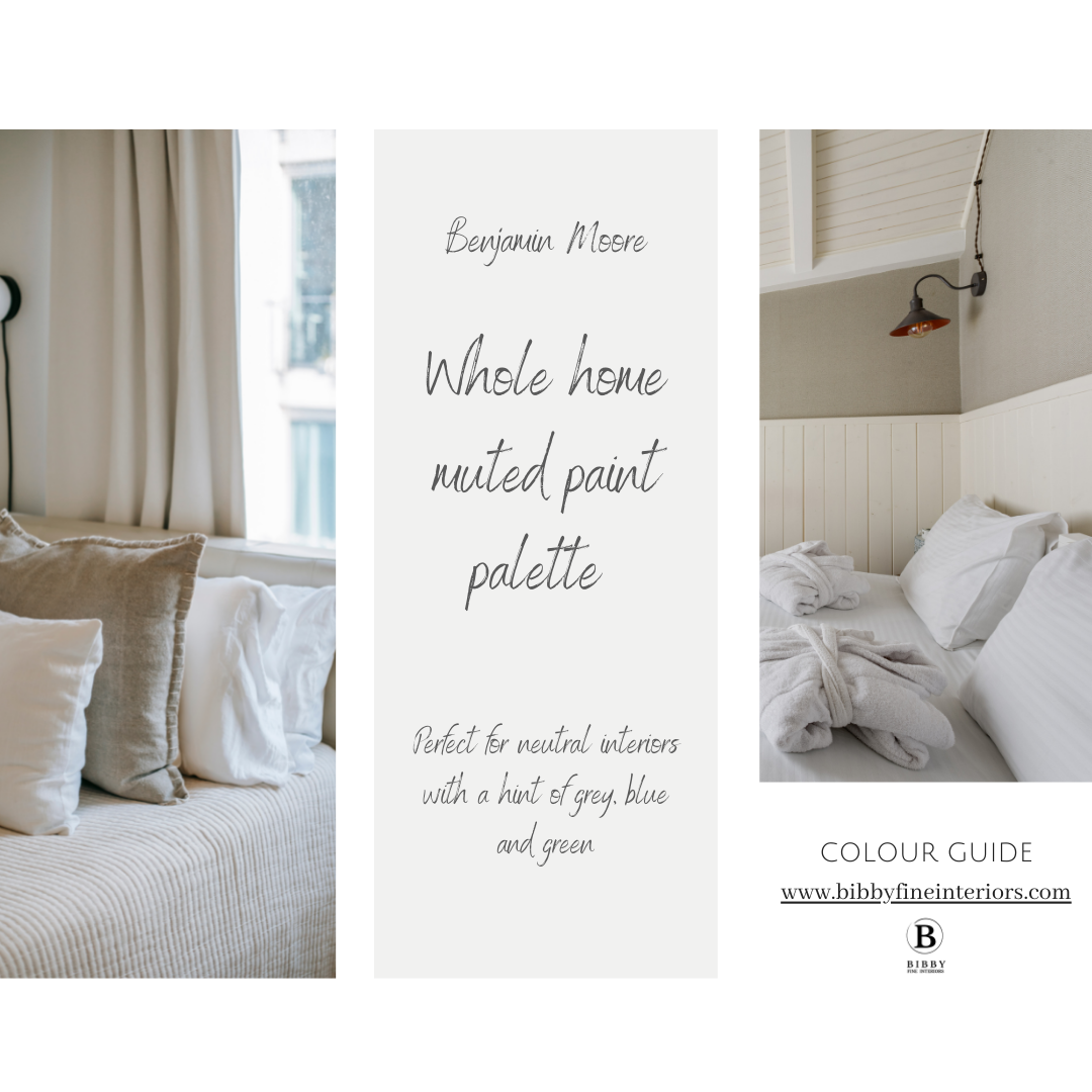
The Muted colour guide is perfect for neutral interiors and has colour palettes with are mostly neutral and has secondary and accent colours with hints of grey, blue and green
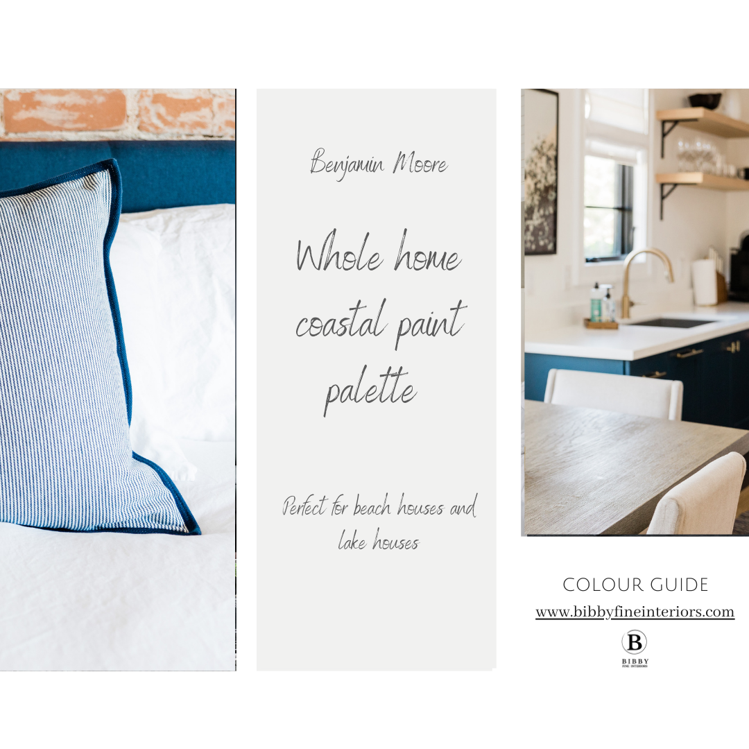
The Coastal colour guide is perfect for beach houses and lake interiors - these palettes range from classic navy interiors to tropical vibrant hues of blues-greens-teals and turquoises
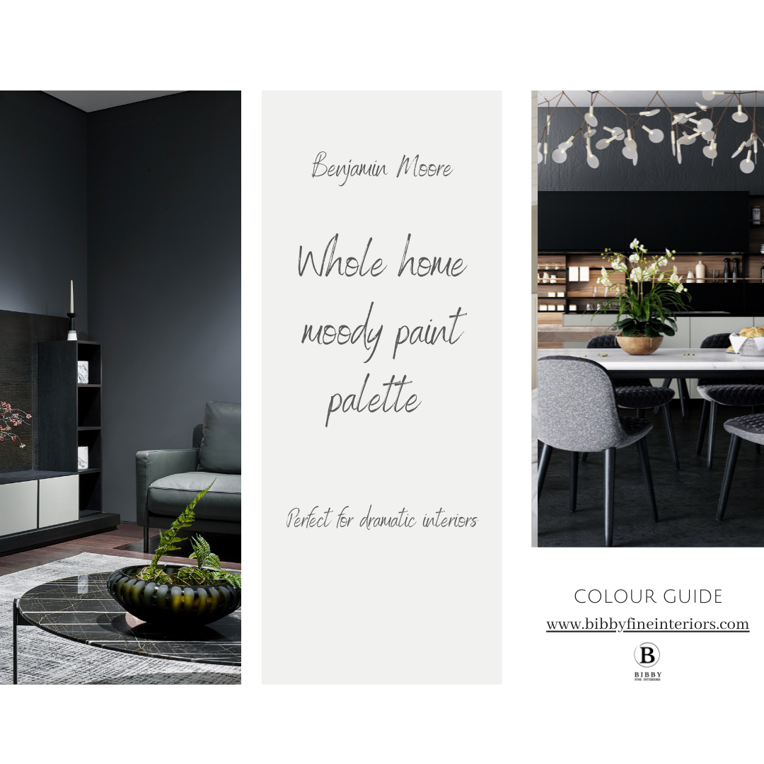
The Moody palette is great for interiors where you would like to add some drama - the colour palette has a range of greys and charcoals and darker neutrals.
If you are still not sure about how to choose paint colours, then we can also assist with a Paint consultation for your next paint project!

No mess Peel and Stick paint samples