Home colour trends 2021
Every year the major paint companies around the world come up with their Colour of the Year and colour trend predictions. I always find this interesting and love to compare how companies and continents see upcoming colour trends. Let’s have a look at what we can expect in the world of color this year.
Pantone Colour(s) of the Year 2021

Pantone Colours of the Year 2021, Image: More than just print
For 20 years, the Pantone’s Color of the Year is THE big announcement that influences multiple industries, including interior deisgn, fashion, home furnishings, and industrial design, as well as product packaging and graphic design. This year it is PANTONE 17-5104 Ultimate Gray + PANTONE 13-0647 Illuminating, two independent colors that highlight how different elements come together to support one another.
Farrow & Ball Colour Trends 2021
The luxury British brand Farrow & Ball colour trends include some clean and timeless blues, such as Pitch Blue, Stiffkey Blue, Ultra Marine Blue and Scotch Blue

The timeless blues of Farrow & Ball, Image: Farrow & Ball
Sherwin-Williams Colour of the Year 2021
The world’s biggest paint company, Sherwin Williams announce Urbane Bronze as their colour of the year, it is a moody, sophisticated colour that will bring dimension into any space.

Sherwin Williams Urbane Bronze, Image: Sherwin Williams
Dulux / PPG Colour Trends 2021
Dulux / PPG another big paint influencer choose a trio of natural hues, Transcend, Misty Aqua and Big Cypress. According to PPG the color trio celebrates beauty of all kinds and relates to those who prioritize wellness in mind, body and spirit.

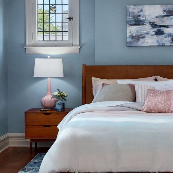
Benjamin Moore Colour of the Year and Colour Trends 2021
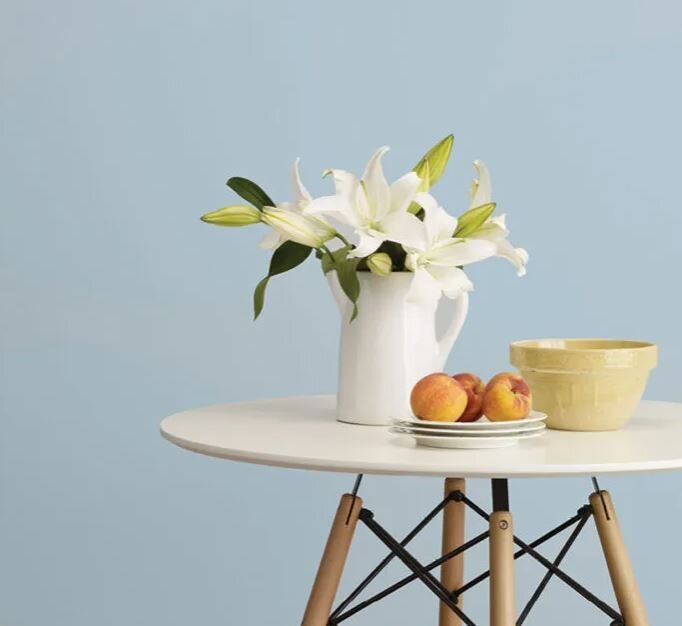
I just love the greenish blue from Benjamin Moore, these are the tones I have in my own house. It is called Aegean Teal and is a soothing blue-green hue with just a hint of grey.

Benjamin Moore Colour of the Year is Aegean Teal, Image: Benjamin Moore
Beauti-Tone Colour of the Year 2021
Beauti-Tone has also chosen a very calm blue as their colour of the year - it is called Dancing in the rain, I love this one too!
Beauti-Tone Colour of the Year 2021, Dancing in the rain. Image: Home Hardware
Valspar Colour of the Year 2021
Goodness, the blues are so popular this year. Valspar announced that their colour of the year is Blissful Blue, a lovely homely blue to help us continue to embrace the idea of spending more at home and loving where we live.
Valspar Blissful Blue, Image: Valspar
Behr Colour Trends 2021
Behr has come up with a palette of 21 hues spanning from essential neutrals to lavish bolds and is sure to be very popular with designer and homeowners this year.

Behr colour trends 2021, Image: Behr
And the trending colour is ….blue
Well, there you go, it does seem as if the blues and blue-green colour are trending this year. After the uncertain 2020 we had, I am not surprised that the calming blue colours were chosen by colour experts around the wor
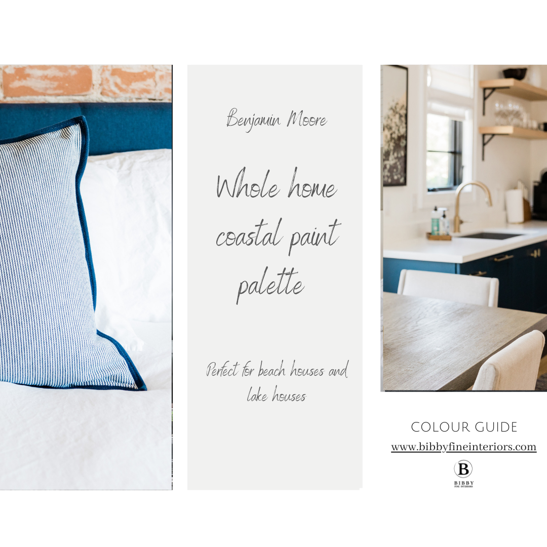
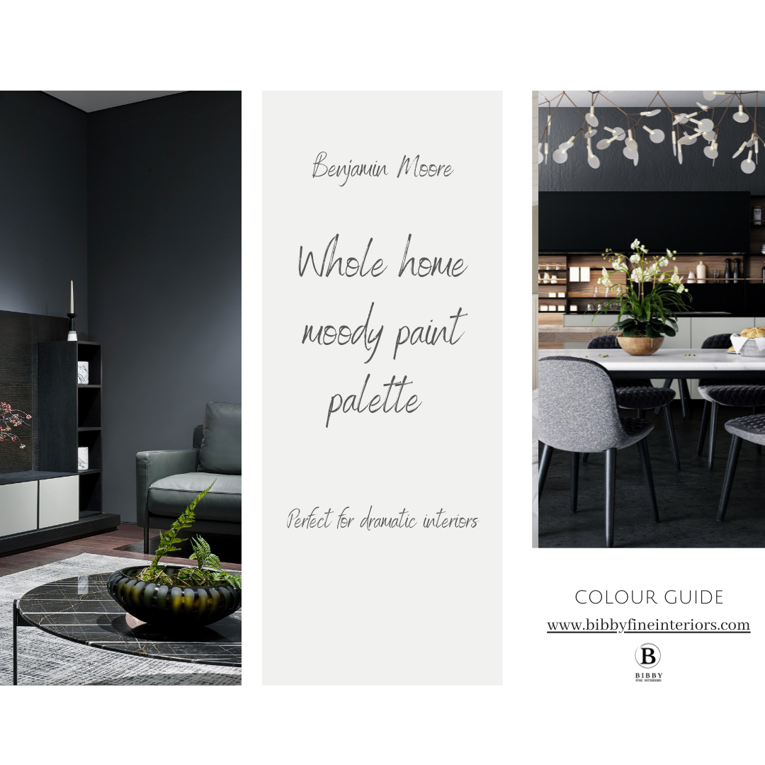
Take the guess work out choosing colours, get your own Whole home colour guide
Need some help with choosing colours for your home? Not sure which colours will go with each other and which colour to use for your ceilings and trims? Our handy colour guides takes the guess work out of choosing colours.
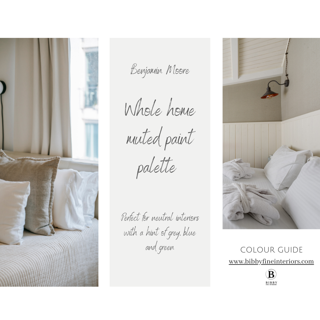
Our carefully curated collection of Benjamin Moore paint palettes are perfect for the home owner who needs assistance putting an interior colour palette together. We implement our 60/30/10 concept to help you get the balance right the first time! Our palettes show you which colour should take up 60% (primary colour) of your room, which colour should take up 30% (secondary colour) and finally which colour should be your accent colour, only taking up 10%. These percentages should take into account cabinetry and large furniture items of your room too. You can use just one of the palettes for a specific room or an open plan concept or more than one palette for a whole home paint colour scheme.
This is what you get:
Four carefully curated paint palettes
Each paint palette contains 3 colours which compliment each other
Each paint palette visually shows you which colour should be your primary, secondary and accent colour
Bonus extra: The perfect trim, door, cabinet and ceiling colour to compliment each scheme
Which colour guide to choose?
The Muted colour guide is perfect for neutral interiors and has colour palettes with are mostly neutral and has secondary and accent colours with hints of grey, blue and green
The Coastal colour guide is perfect for beach houses and lake interiors - these palettes range from classic navy interiors to tropical vibrant hues of blues-greens-teals and turquoises
The Moody palette is great for interiors where you would like to add some drama - the colour palette has a range of greys and charcoals and darker neutrals.
If you are still not sure about how to choose paint colours, then we can also assist with a Paint consultation for your next paint project!

No mess Peel and Stick paint samples