Renovation- Free Kitchen Refresh
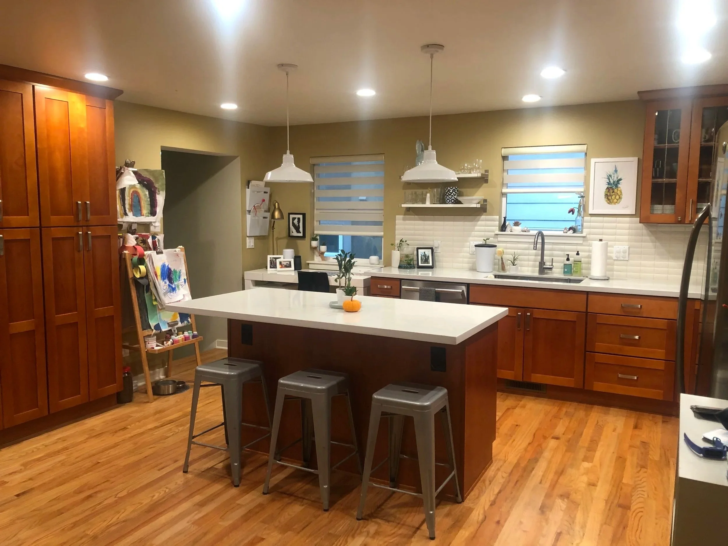
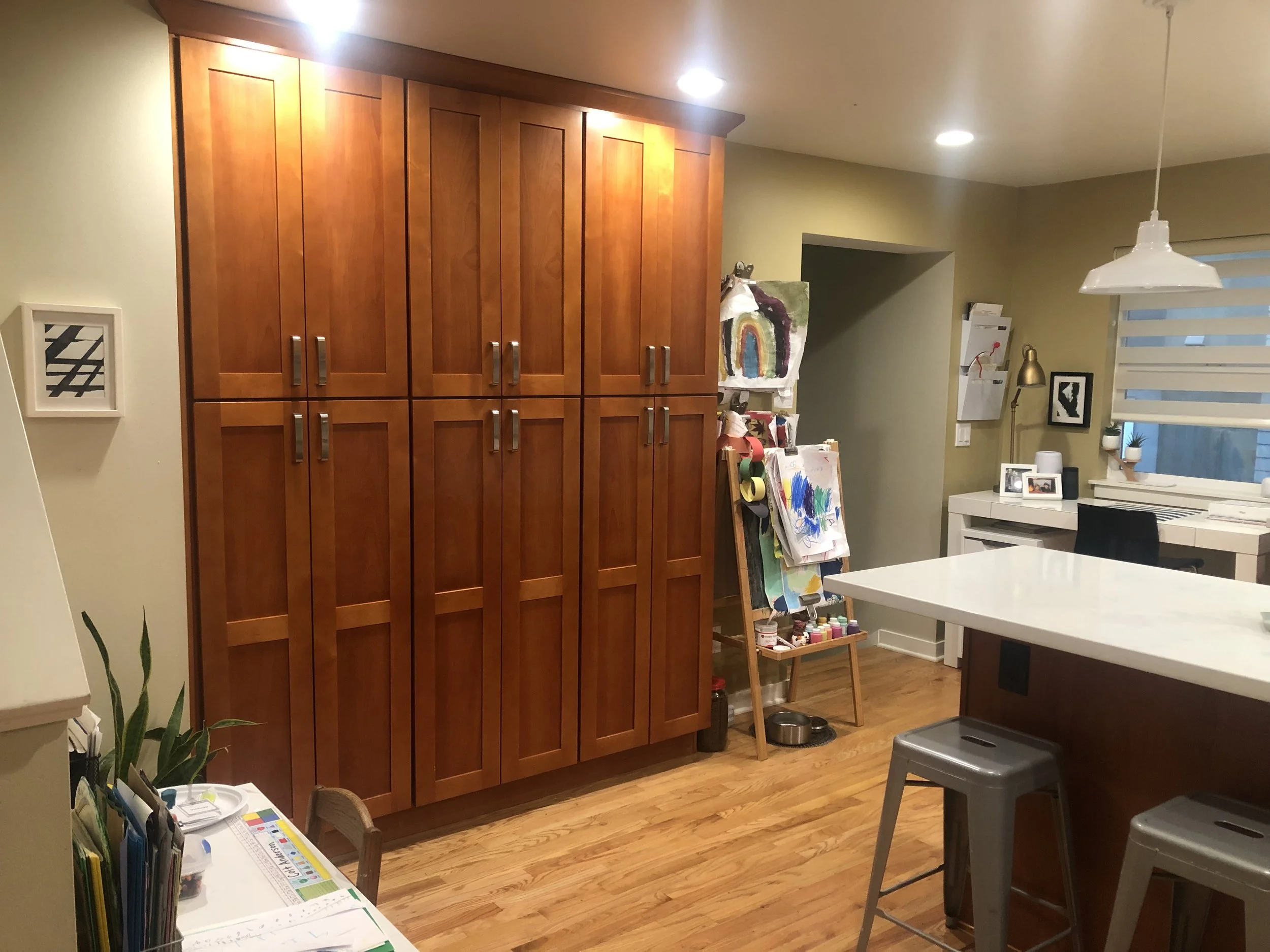
When a Seattle homeowner reached out to me about transforming her dated wooden kitchen, I was thrilled to help bring her vision to life. The space had great bones and a functional layout, but the heavy wood tones and the green wall colour made it feel dark and outdated. She wanted a fresh, updated look, without the mess, stress, and expense of a full renovation.

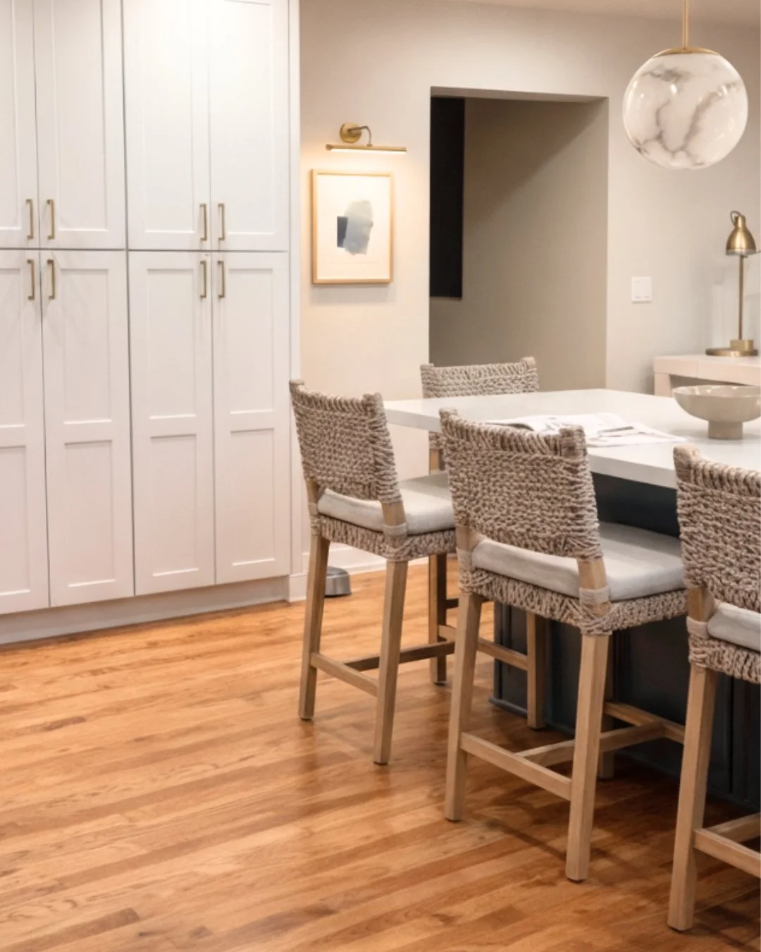
The amazing dust free transformation. Credit: BIbby Fine Interiors
Because she was a remote client, we collaborated entirely through virtual design services. From detailed questionnaires and photos to video consultations and curated design boards, the entire process was seamless. Distance proved to be no obstacle at all. In fact, virtual interior design allowed us to move efficiently, make thoughtful decisions, and stay within budget.
Before
The colour palette
One of the most exciting parts of this project was developing a colour palette that would truly enhance my client’s home while respecting its existing character. Her home already has a lovely, welcoming feel thanks to the beautiful mid-tone wooden floors that run throughout.
Lighting played a major role in our decisions. My client’s home is primarily influenced by a north-facing exposure, which naturally brings in cooler, softer light. The kitchen, however, has a muted western exposure. While it doesn’t receive strong direct sunlight, the afternoon light that filters in carries warmer, yellow undertones. This subtle shift in natural light means that colours can appear very different throughout the day, something we carefully considered before making final selections.
The marble countertop became the anchor for the entire kitchen palette. Marble is never “just white”, it often carries complex undertones. Some slabs lean toward cool greys and soft blues, while others reveal greenish or even slightly purple undertones. Rather than fighting those undertones, we chose to work with them.
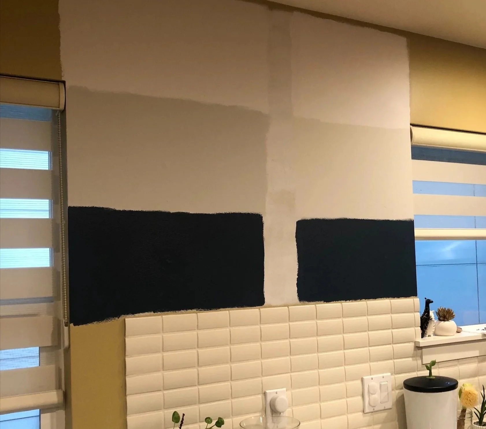
Test for success
I always recommend painting test samples directly in the space because once they’re on the wall, the true undertone becomes much more apparent.
During our consultation, my client mentioned wanting a darker blue for the island. However, because the kitchen does not have abundant natural light, deeper tones risked feeling flat or overly heavy. To ensure the island colour would still feel rich and defined, I selected blues with a higher LRV (Light Reflectance Value). A higher LRV means the colour reflects more light, helping it stay vibrant even in lower-light conditions. Interestingly, these shades will still read darker on the island, particularly under the overhang, while maintaining depth and clarity.
Ultimately, we decided on this colour palette below. To complete the scheme, the ceiling colour is a crisp, clean white with no dominant undertones and an LRV of 90. This high reflectance helps bounce light around the room, creating a bright, airy finish that ties everything together beautifully.
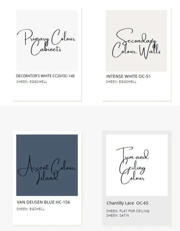
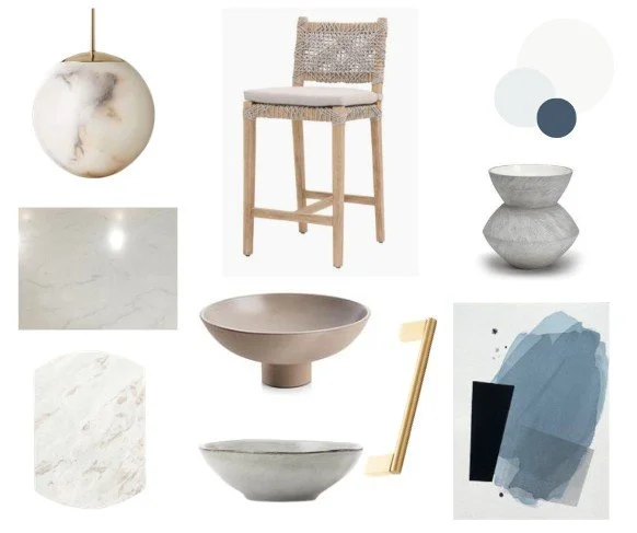
Our colour palette
We use the 70/20/10 colour rule. The cabinet colours take up 70% of the room, the remaining wall colour 20% and our accent colour, the kitchenisland, make up the remaining 10%
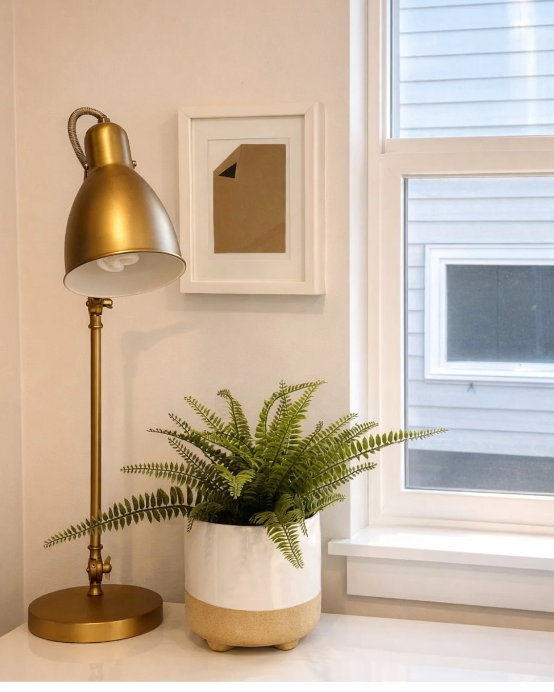
Great accent pieces
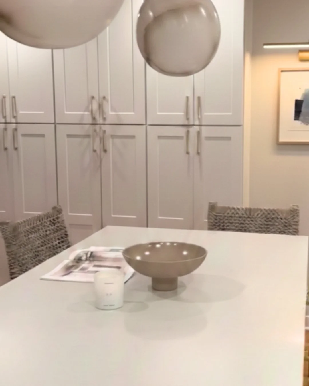
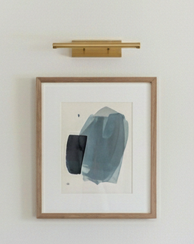
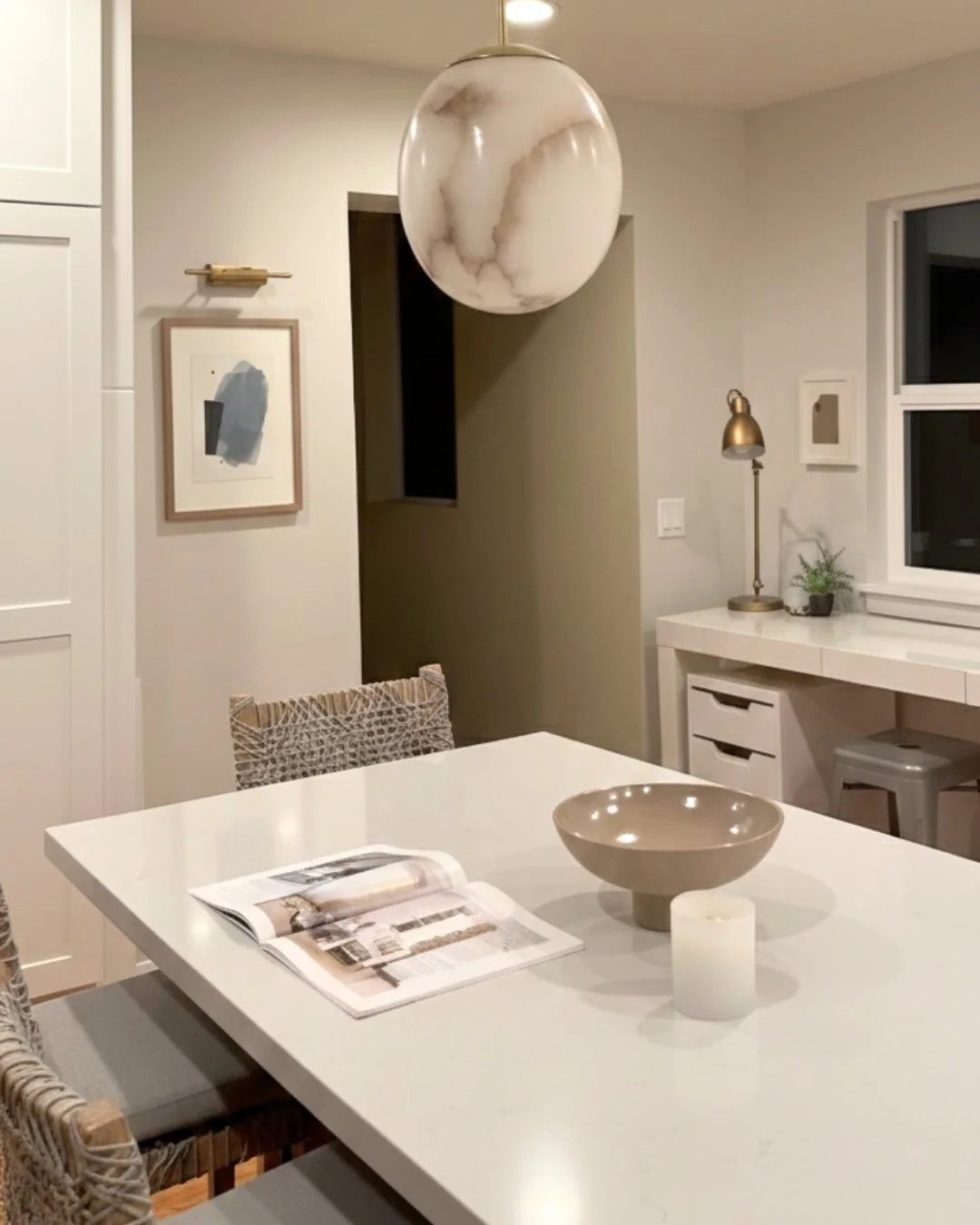
One of our key inspiration pieces was the alabaster pendants. When illuminated, the soft glow from within gently radiates through the naturally translucent stone, revealing its beautiful tonal shifts and delicate veining. We also included the following items
Contemporary accents
Through strategic paint selections, modern hardware, updated lighting, and carefully chosen décor, we completely transformed the look and feel of her kitchen..
After
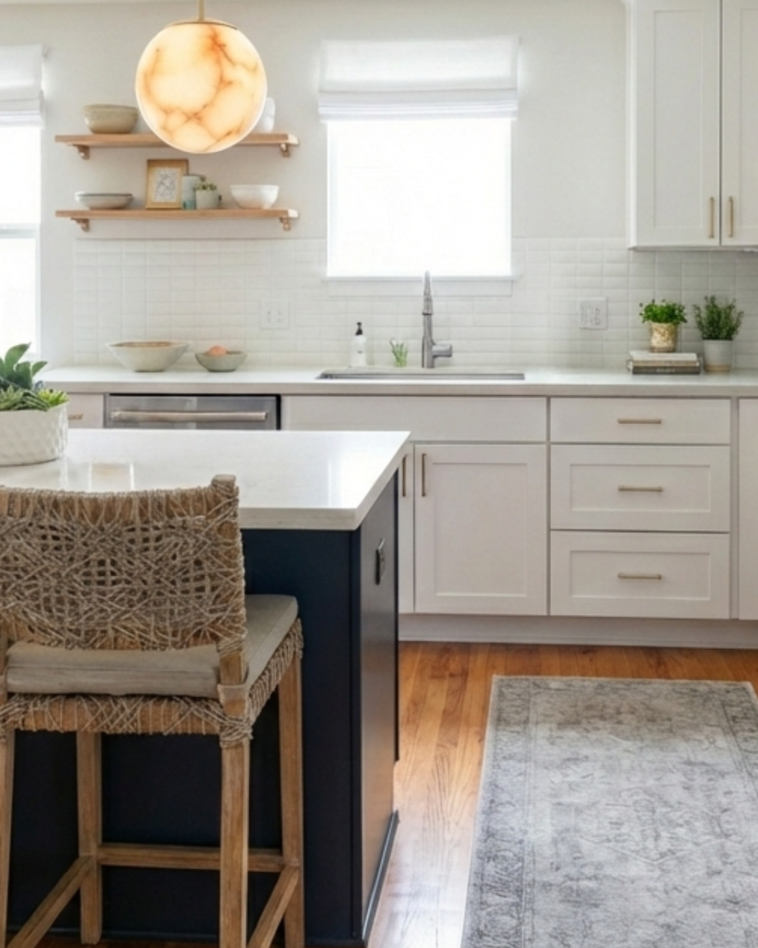
My client loves the end result
Rather than tearing out cabinetry or undergoing a costly remodel, we focused on smart, high-impact updates. Through strategic paint selections, modern hardware, updated lighting, and carefully chosen décor, we completely transformed the look and feel of her kitchen. The heavy wood tones were balanced with lighter finishes, fresh textures, and contemporary accents that brightened the entire space.
A stunning kitchen refresh is possible without demolition, dust, or overwhelming costs. This project is a perfect example of how thoughtful design, combined with virtual collaboration, can breathe new life into a space while keeping the process simple and stress-free.
Whether you’re local or across the country (or anywhere in the world), we would happy to assist!
Get in touch today with your project, email us at info@bibbyfineinteriors.com
Note: Some images have been enhanced by AI assistance